
Savr
This project was conducted as a modified solo version of the 5 Day Design Sprint following the Google Ventures framework. It consisted of mapping, brainstormings, sketching, swift decision-making, prototyping and testing.
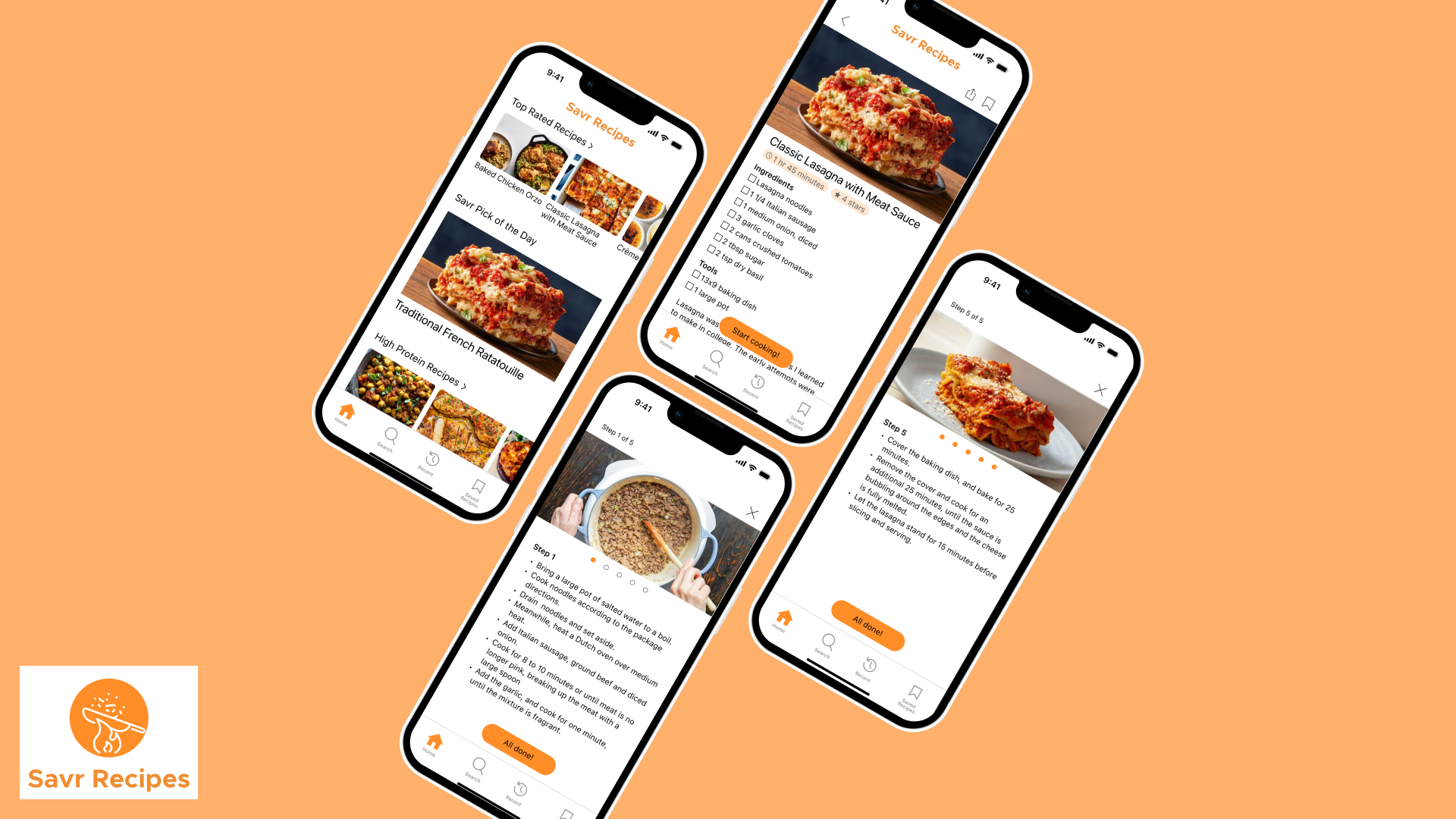
The Problem
Following recipes on cooking apps can be difficult due to recipe complexity, confusing step orders, unfamiliar techniques, and unclear timing and prep requirements.
The Solution
A mobile-first recipe experience with step-by-step video demonstrations, integrated timing guidance, and contextual tips that makes cooking complex recipes enjoyable for every level of home cook.
Day 1: Understand & Map
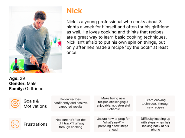
The brief for the sprint provided Nick as the primary persona to guide design decisions
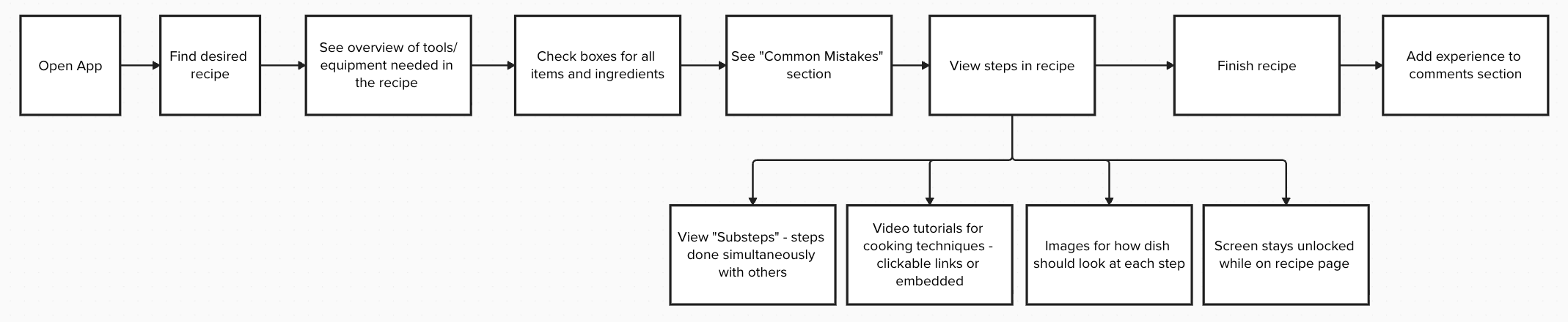
I created an end-to-end journey map of Nick's experience from discovering a recipe to finishing the dish
Day 2: Sketch Solutions
Lightning Demos
Before sketching my own solutions, I researched how other recipe apps handle complex cooking experiences. I examined three competitors to identify inspiration and patterns:
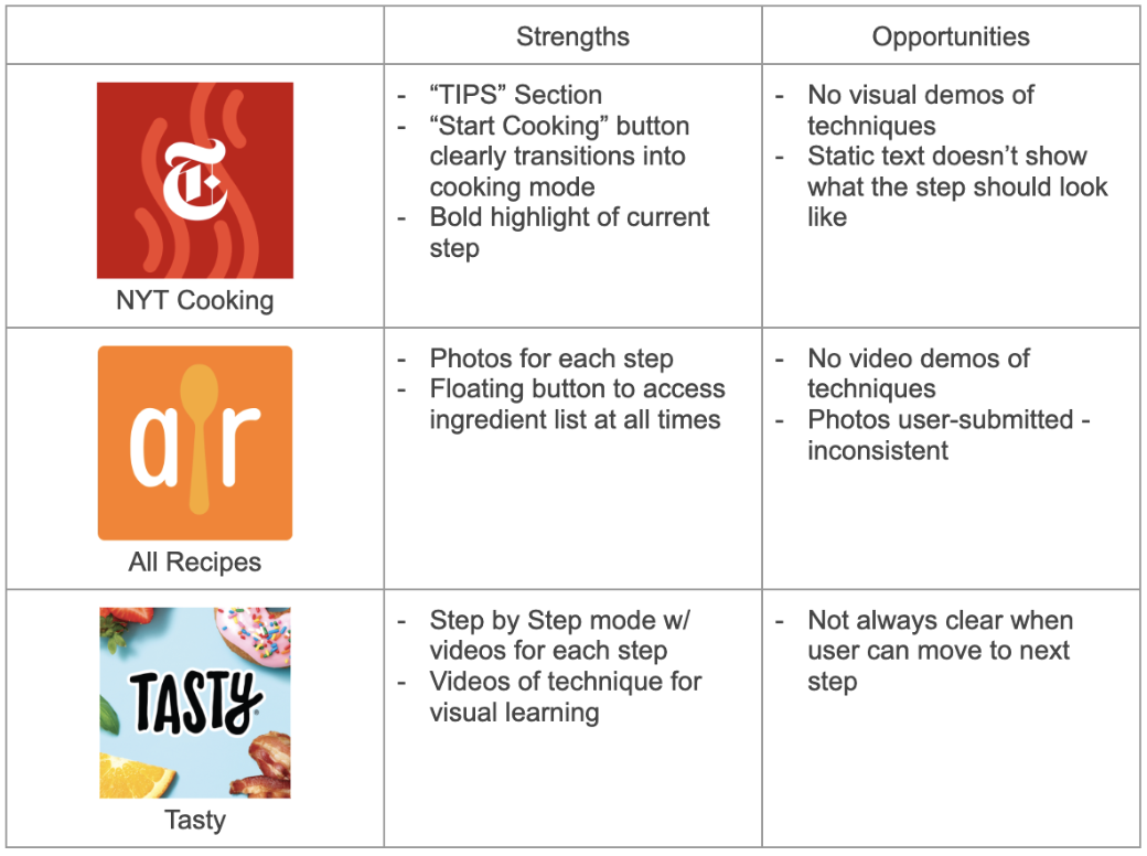
*Key Takeaway: The most successful pattern combined visuals demos with clean step-focused interface, but no app fully solved the timing/multitasking problem identified in research.
Crazy 8s: Rapid Ideation
Using the Crazy 8s exercise, I sketched 8 different concepts for the critical cooking screen in 8 minutes:
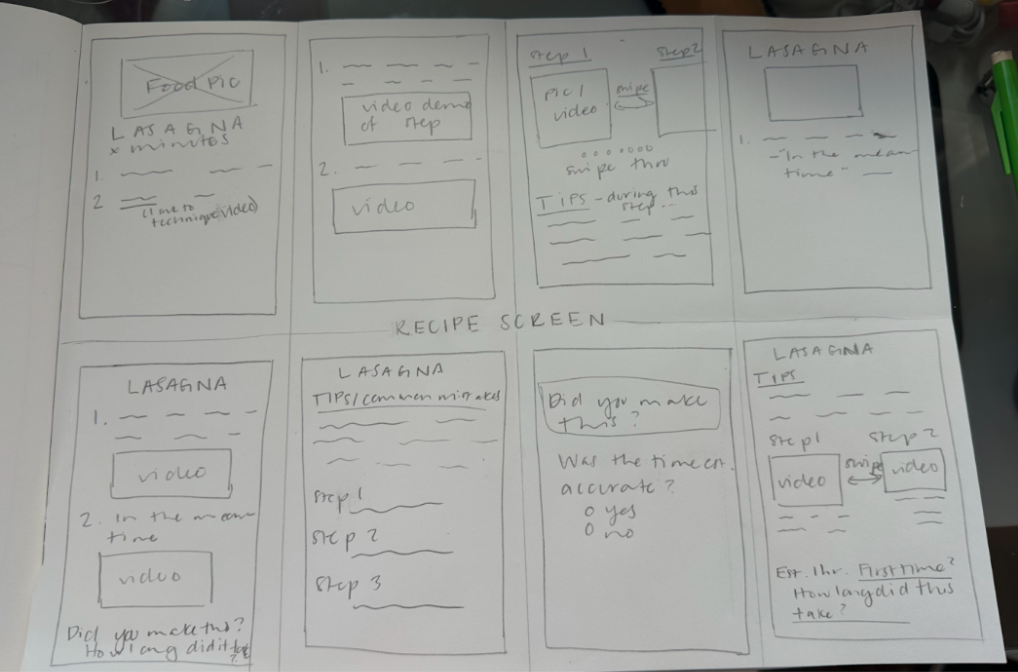
My 8 sketches explored:
Split-screen video + text layout
Carousel of steps with thumbnail videos
Collapsible ingredient side panel
Timer integration in step cards
"Meanwhile" indicators between steps
Technique pop-up overlays
Full-screen video with swipe-to-advance
Progress bar with step preview
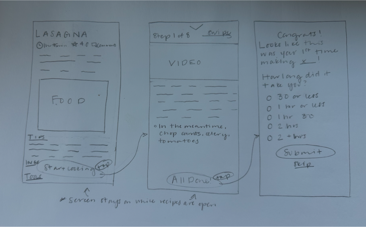
After sketching these solutions, I chose the strongest one because it included maximum video visibility for guidance, lessens cognitive load by showing one step at a time, and provides clear progress tracking.
Day 3: Decide & Storyboard
I reviewed my solution sketch against the user research findings to validate the direction and address pain points.
Panel 1-2: Entry & Discovery
Panel 3-4: Recipe Selection & Preparation
Panel 5: Transition to Cooking Mode
Panel 6-7: Active Cooking Experience (Core Experience)
Panel 8: Completion
Day 4: Prototype
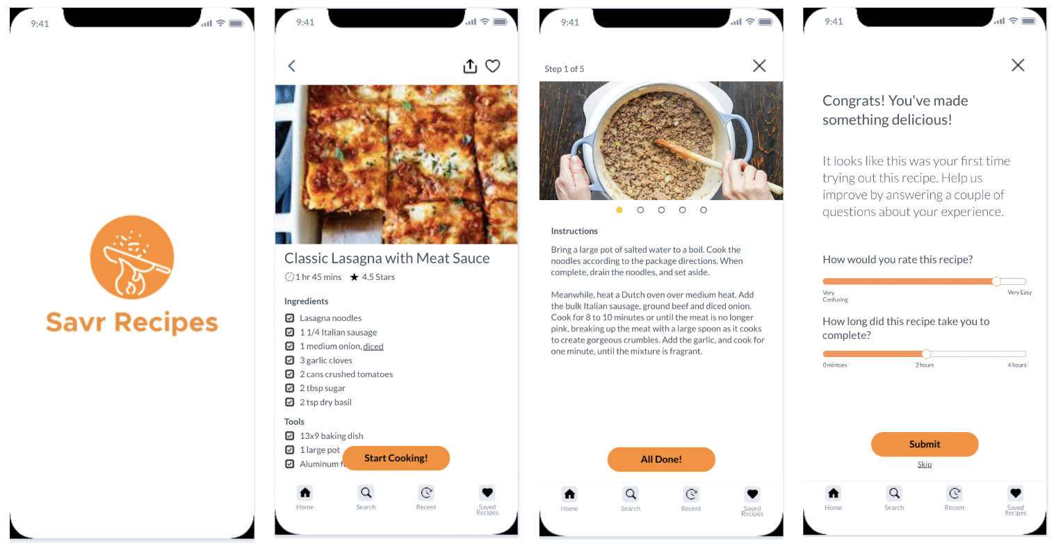
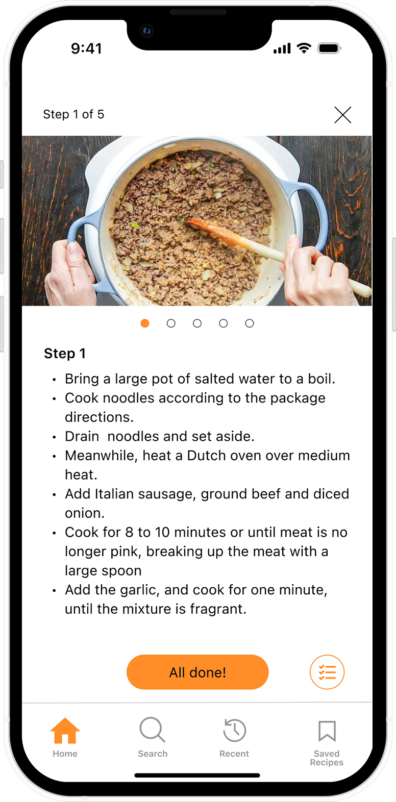
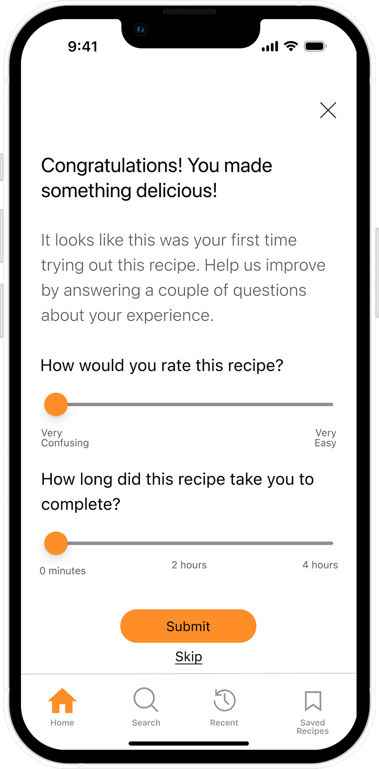
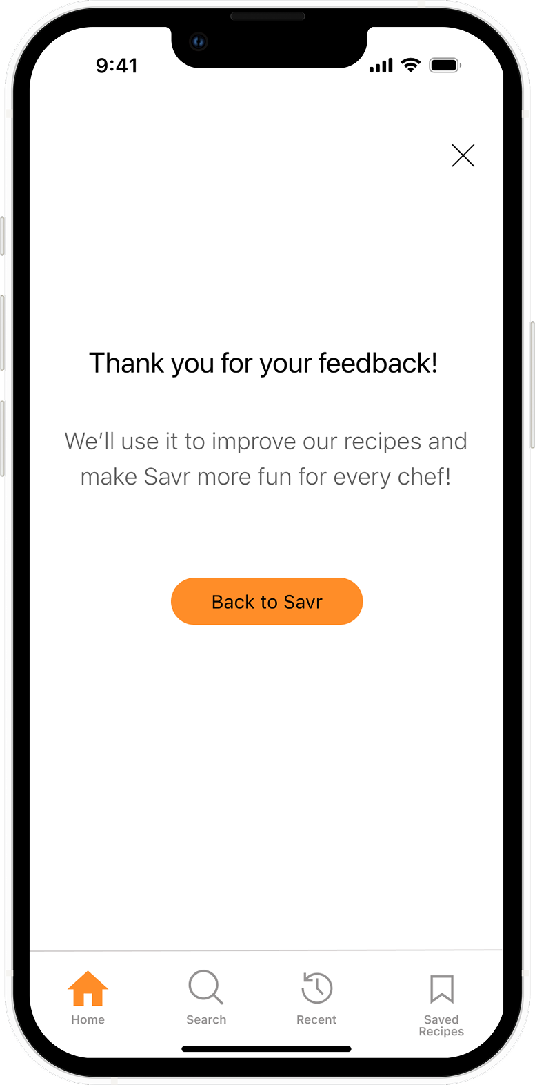
I created an interactive prototype using Marvel that brought the storyboard to life. The prototype focused on the core cooking experience for a Classic Lasagna with Meat Sauce recipe.
Design Decisions:
Visual Hierarchy:
Recipe photos are large and appetizing to create desire
Time estimates and ratings are prominent
Videos are sized to be clearly visible but don't overwhelm the instruction text
Generous white space during cooking reduces visual stress
Micro-interactions:
Ingredient checkboxes provide satisfying feedback
Progress bar fills proportionally to steps completed
Swipe gesture includes subtle animation for fluidity
Technique overlays slide up from bottom (familiar pattern)
Color & Typography:
Orange accent color (from Savr brand) used for CTAs and progress
Clean, sans-serif typography for legibility on mobile screens
Sufficient contrast for kitchen lighting conditions
Minimum 16pt font size for readability from a distance
Day 5: Testing
Interview Setup & Methodology
To gather insights into users' interactions with the product, I conducted usability testing with 5 participants who enjoy cooking at home and regularly use recipe apps. This was extremely crucial to identify areas for improvement in terms of functionality and user experience.
Key Insights
No major usability issues were detected. All 5 participants were able to complete all given tasks.
Step-by-step video feature received universal praise for reducing technique uncertainty and providing visual confirmation.
Some opportunities for enhancement were identified around timing tools and ingredient access.
User Feedback
Integrated timers:
Users expressed strong desire for built-in timers to avoid touching their phones with messy hands. Mentioned by 4 out of 5 participants across different cooking contexts.
Quick ingredient access:
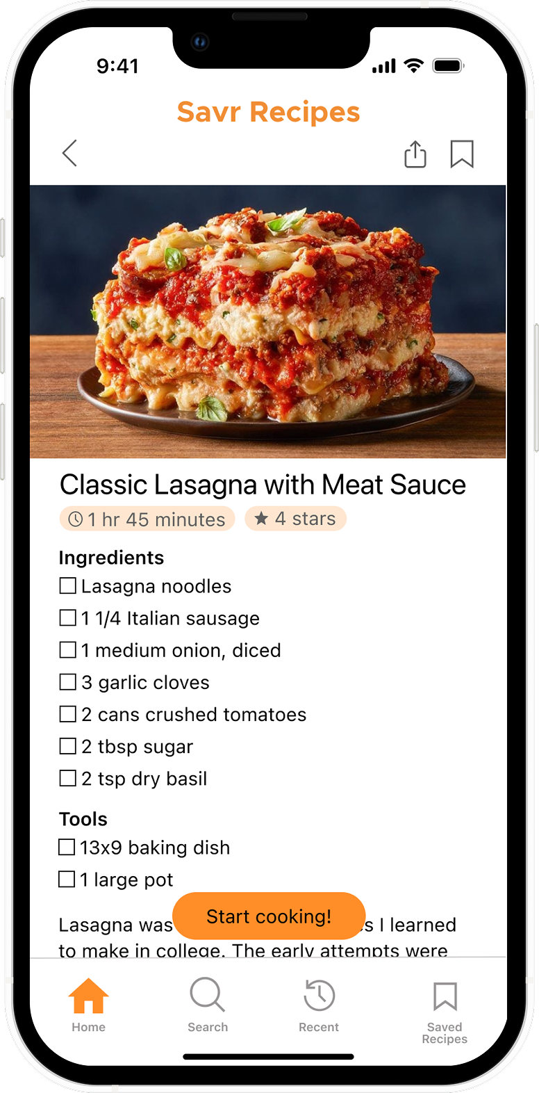
Users wanted easier access to the ingredients list while cooking without losing their place in the recipe steps. A floating access button was added to solve for the friction.
Multitasking guidance:
Users wanted explicit "meanwhile" or "while this cooks" instructions to maximize efficiency and avoid wasted time during waiting periods.
Reflections
Completing this Design Sprint was a challenging and rewarding experience that pushed me to make effective design decisions quickly. This was my first experience conducting a structured design sprint, and it taught me the value of constraints. The 5-day timeframe forced decisive action and prevented me from overthinking decisions. Working with the provided persona and research helped me stay focused on solving real user problems rather than getting lost in feature ideas.
One of the key insights that emerged from this sprint was the importance of integrating step-by-step video demonstrations into the cooking flow, to help users feel confident they're executing techniques correctly and see what dishes should look like at each stage.
If there were more time, I would've liked to conduct another round of usability testing after implementing the high-priority features (integrated timers, ingredient quick-access) to validate those solutions. Additionally, more time would have allowed for deeper exploration of multitasking guidance and prep-ahead features to help users cook more efficiently.