
Flowtrip: Balancing Structure and Spontaneity in Travel Planning
ROLE
UX/UI Designer
PROBLEM
Travelers struggled to balance planned activities with the flexibility they craved, leaving them with itineraries that felt either too rigid or too unstructured.
100%
Task Completion
TIMELINE
3 Months
TOOLS
Figma, Mural, Google Suite
MY CONTRIBUTION
End-to-end UX/UI including user research, flows, wireframes, UI design, prototyping, and two rounds of usability testing.
4.9/5
Ease Rating
4.6/5
Likelihood of Use
WHAT I’D DO NEXT
Add travel-time logic between activities and collaborative planning for group trips.
Phase 1: Discover
The Challenge
Travelers struggle to balance visiting must-see attractions with leaving room for rest and spontaneous experiences, leading to itineraries that feel either too rigid or too unstructured.
Understanding the Users
Research Methods
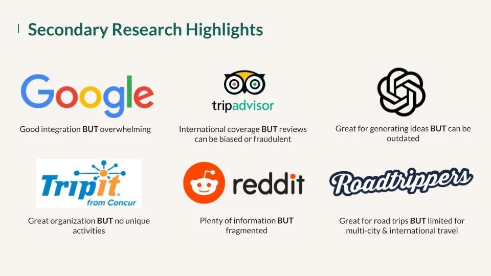
Secondary Research:
I analyzed existing trip planning tools (TripIt, Google Travel, Roadtrippers, ChatGPT) and identified their strengths and weaknesses.
User Interviews:
I conducted in-depth interviews with 4 frequent leisure travelers (ages 28-31) who take multiple trips a year. These conversations revealed consistent pain points and desires across different travel styles.
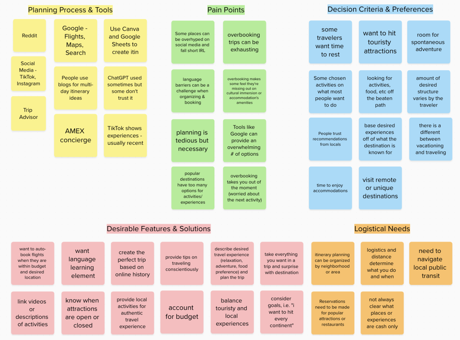
Thematic Analysis
After conducting the interviews, I used an affinity map to organize key themes and find commonalities between the different travelers. I referred back to detailed notes and recordings in this process.
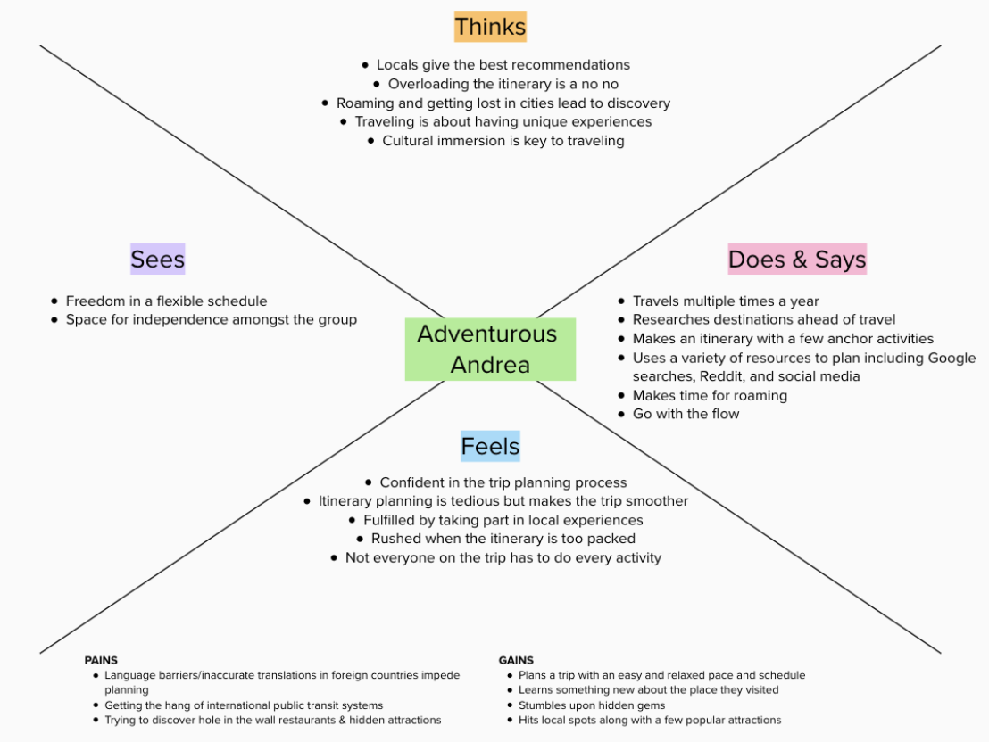
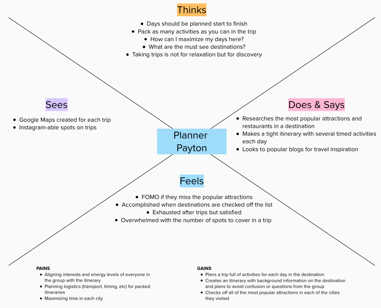
Personas
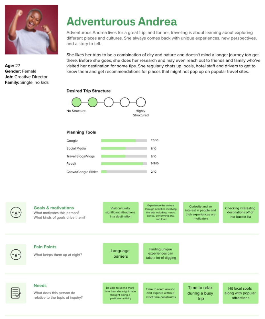
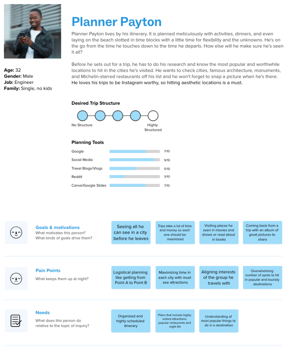
Building on two empathy maps, I developed personas that captured the wants, needs, and challenges of each identified user type.
Ideation & Wireframes
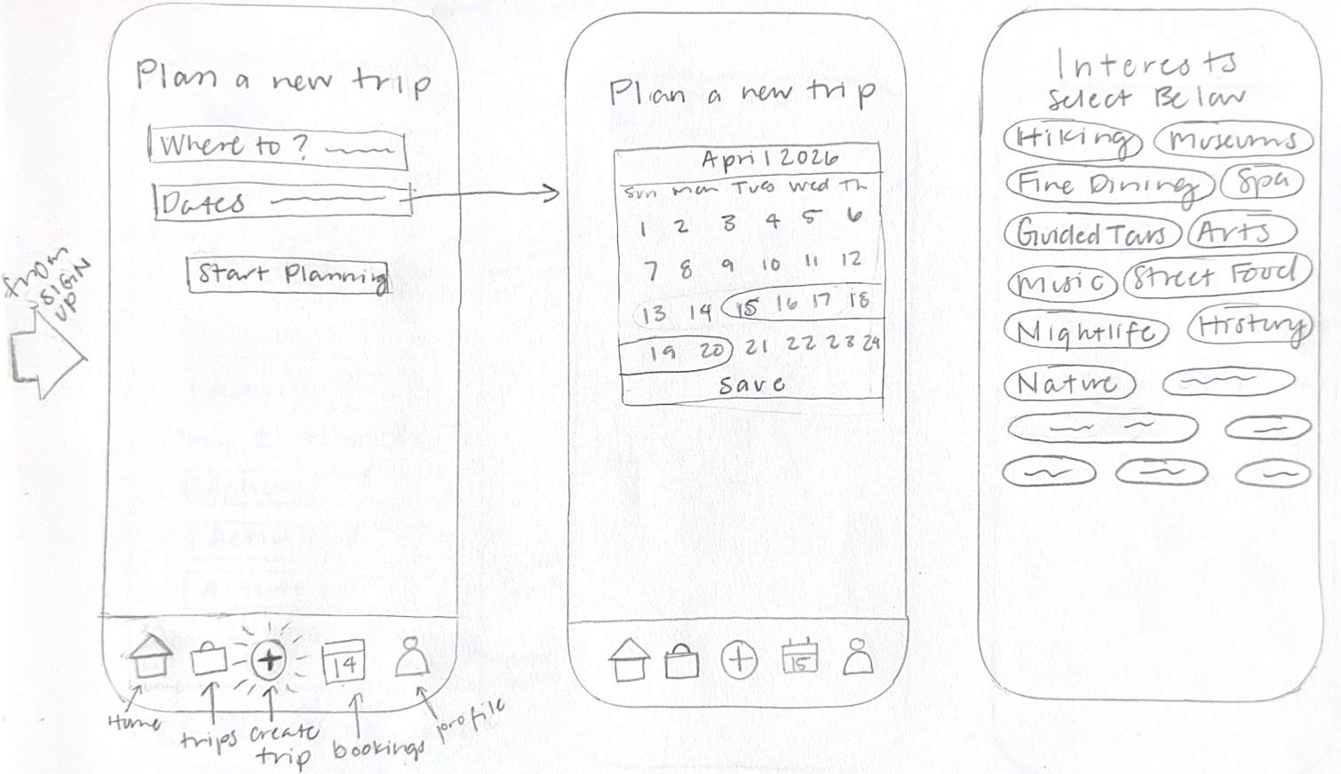
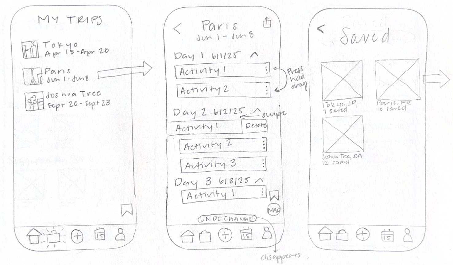
Through affinity mapping, I identified priority features for the MVP: attractions matching user interests, all activities in one place, and itinerary points on a map.
Several participants mentioned the "overwhelming amount of information" and the need for "everything in one place." I needed to solve the core problem before tackling group features or real-time alerts.
Phase 2: Design
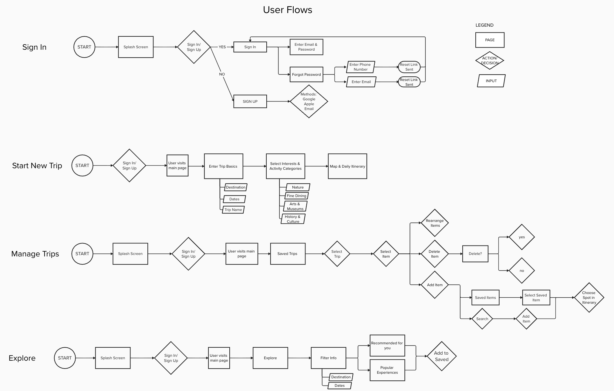
Information Architecture
UI Design & Branding
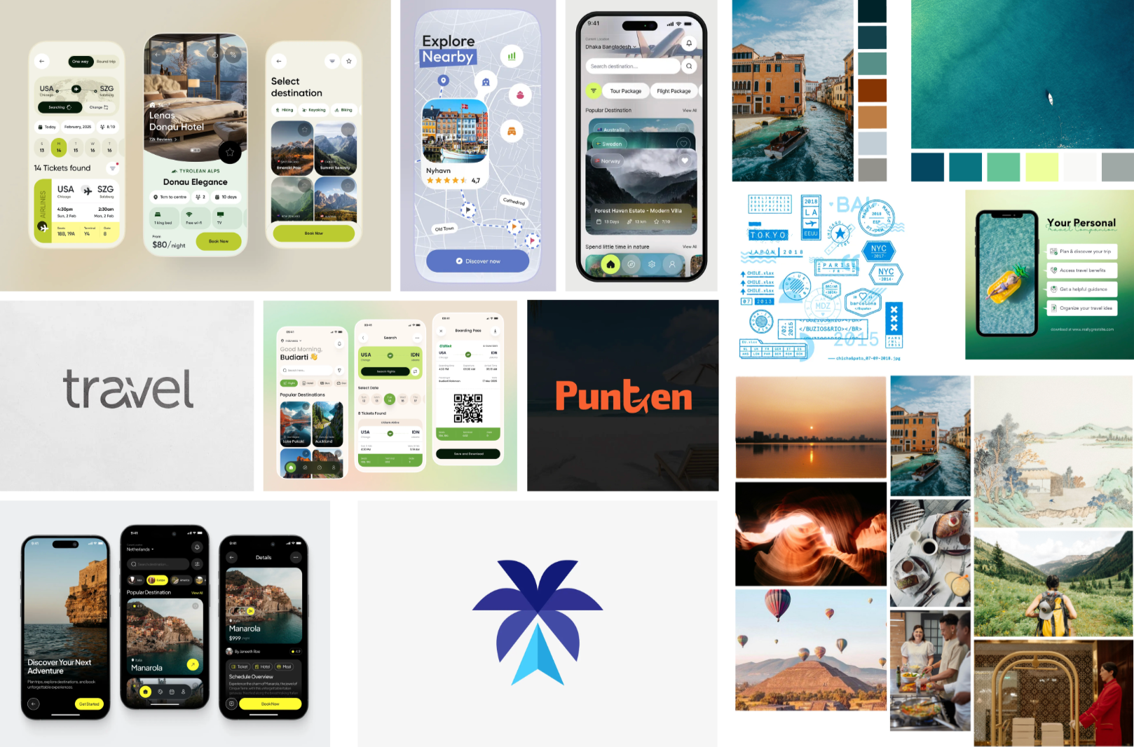
Flowtrip is the calm, knowledgeable friend who always knows how to make the most of a destination: organized but flexible, adventurous but thoughtful.
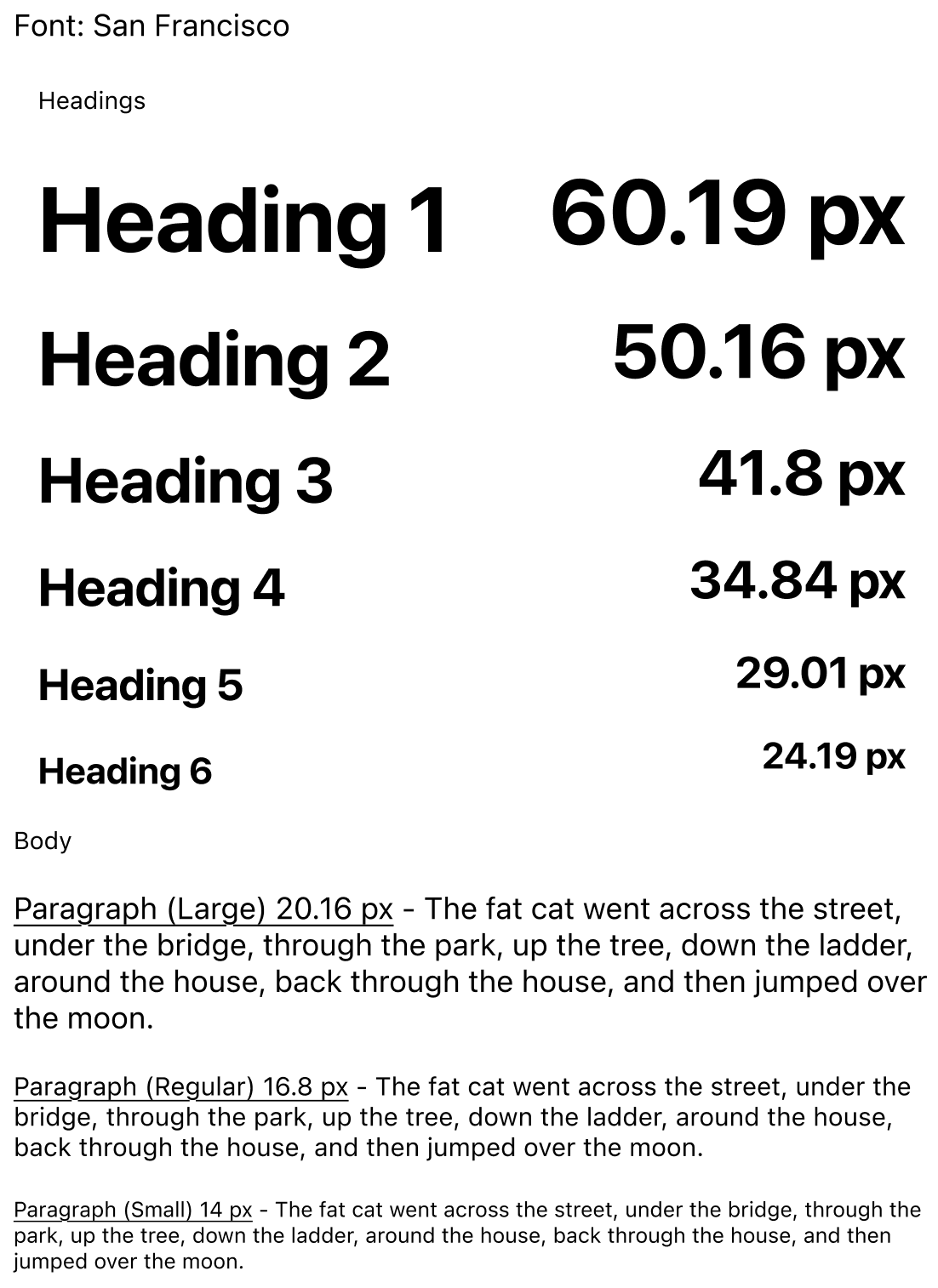
Colors & Typography
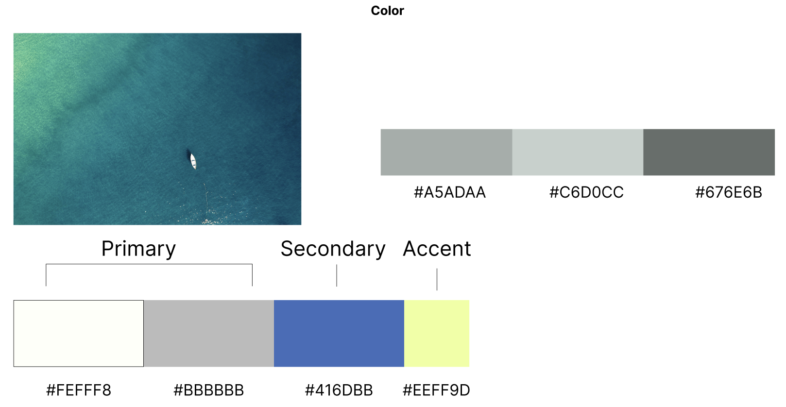
Off-white (#FEFFF8) — Clean, breathable background that lets destinations take center stage
Light gray (#BBBBBB) — Soft and unobtrusive, supports secondary UI elements without competing with the brand colors
Royal blue (#416DBB) — Confident and reliable, anchors the interface with a sense of trust and direction
Lime yellow (#EEFF9D) — Energy and anticipation, a reminder that planning should be as fun as the trip
High Fidelity Screens
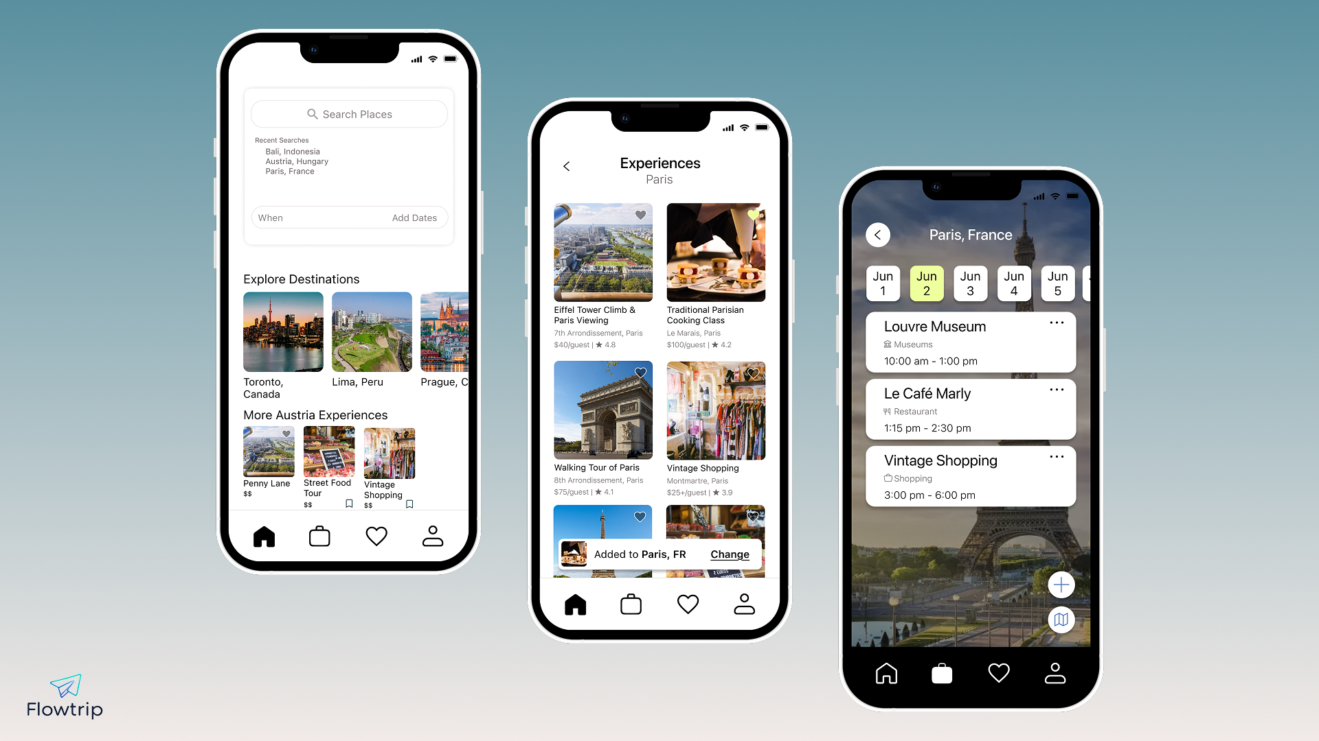
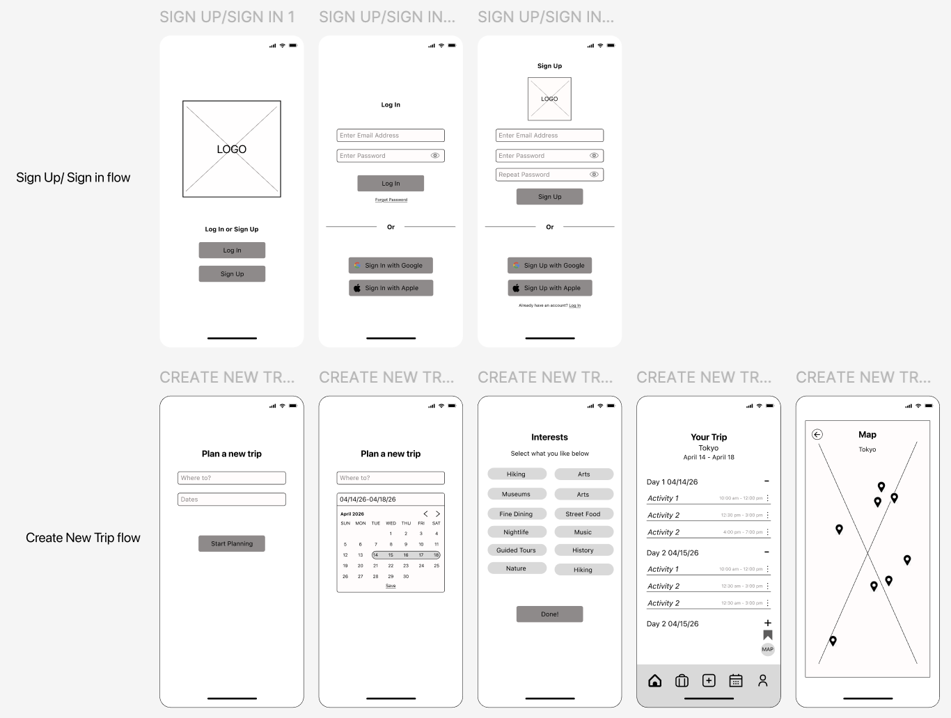
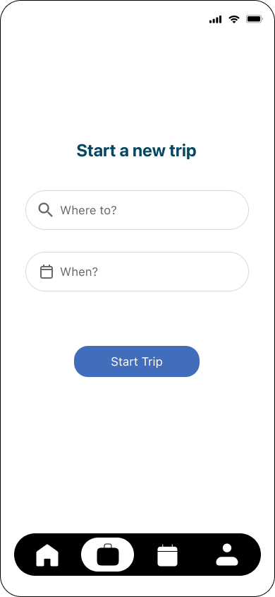
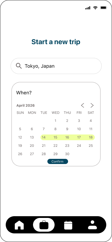
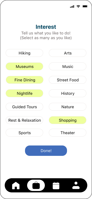
Intelligent trip creation
The trip creation flow was designed to feel like a conversation, not a form. By collecting interests upfront, Flowtrip generates a personalized starting itinerary rather than leaving users with a blank slate.
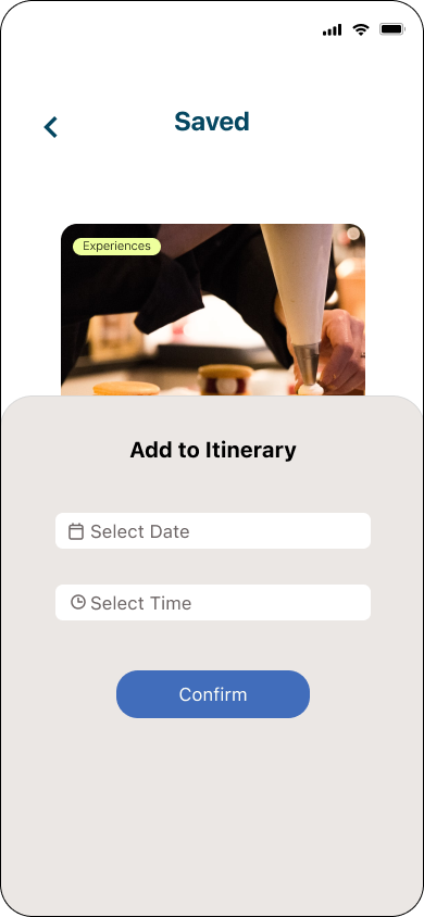
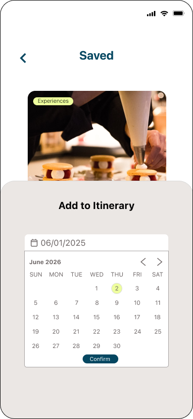
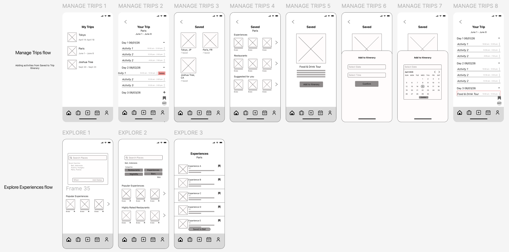
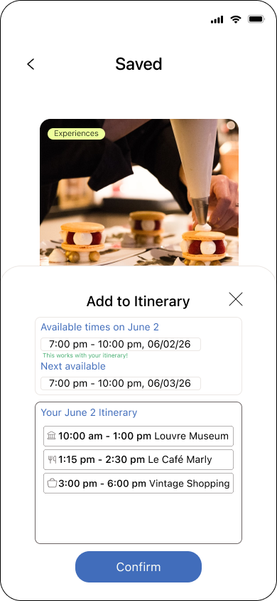
Easy activity scheduling
Users needed to add saved activities without anxiety about time conflicts. The scheduling flow shows available slots and confirms fit with a green indicator, removing the guesswork entirely.
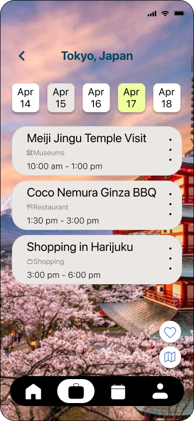
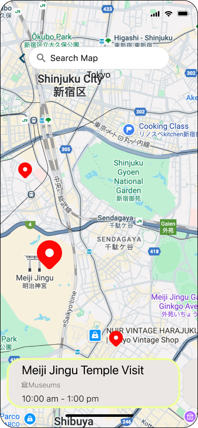
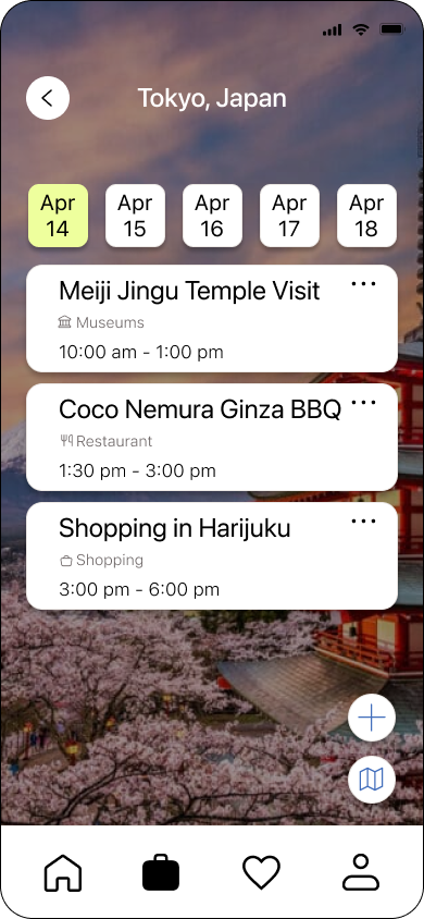
Visual itinerary with integrated map
Seeing activities plotted on a map gives travelers spatial context that a list alone can't provide — one of the most requested features from user interviews.
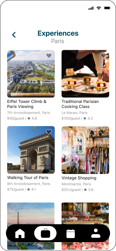
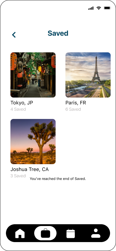
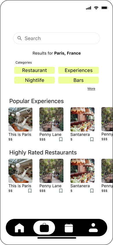
Experience discovery and curation
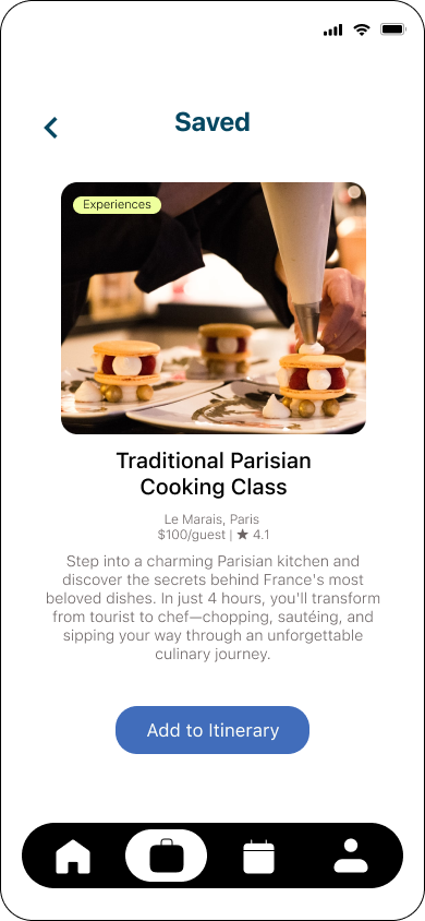
The explore section was designed around how travelers actually research: browsing by category, filtering by what matters to them, and saving what catches their eye.
Phase 3: Validate
Testing & Iteration
Round One
Moderated tests with 5 participants (ages 22-45, frequent travelers) across 3 core tasks.
PROBLEM
4/5 users couldn't find saved items — clicked calendar and profile before discovering the heart icon.
PROBLEM
3/5 users had no visibility into their schedule when adding activities, creating anxiety about conflicts.
SOLUTION
Changed calendar icon to heart in tab bar. Changed "add to itinerary" button from heart to plus sign.
SOLUTION
Added mini itinerary preview showing existing activities, available slots, and a green fit indicator.
Round Two
After implementing changes, I conducted a second round with 5 new participants.
Task completion improved from 80% to 100% after iteration, with zero critical issues remaining and a 4.9/5 ease rating.
100%
Task Completion
4.9/5
Ease Rating
4.6/5
Likelihood of Use
Conclusion
Flowtrip validated that travelers want guidance without losing the joy of discovery. Through two rounds of testing, the biggest lesson was that small, targeted changes, like adding the mini itinerary preview, had the highest impact on user confidence and task success.
The process reinforced something I believe strongly as a designer: the best solutions come from watching real people use your product, not from assuming you already know what they need.
What’s Next