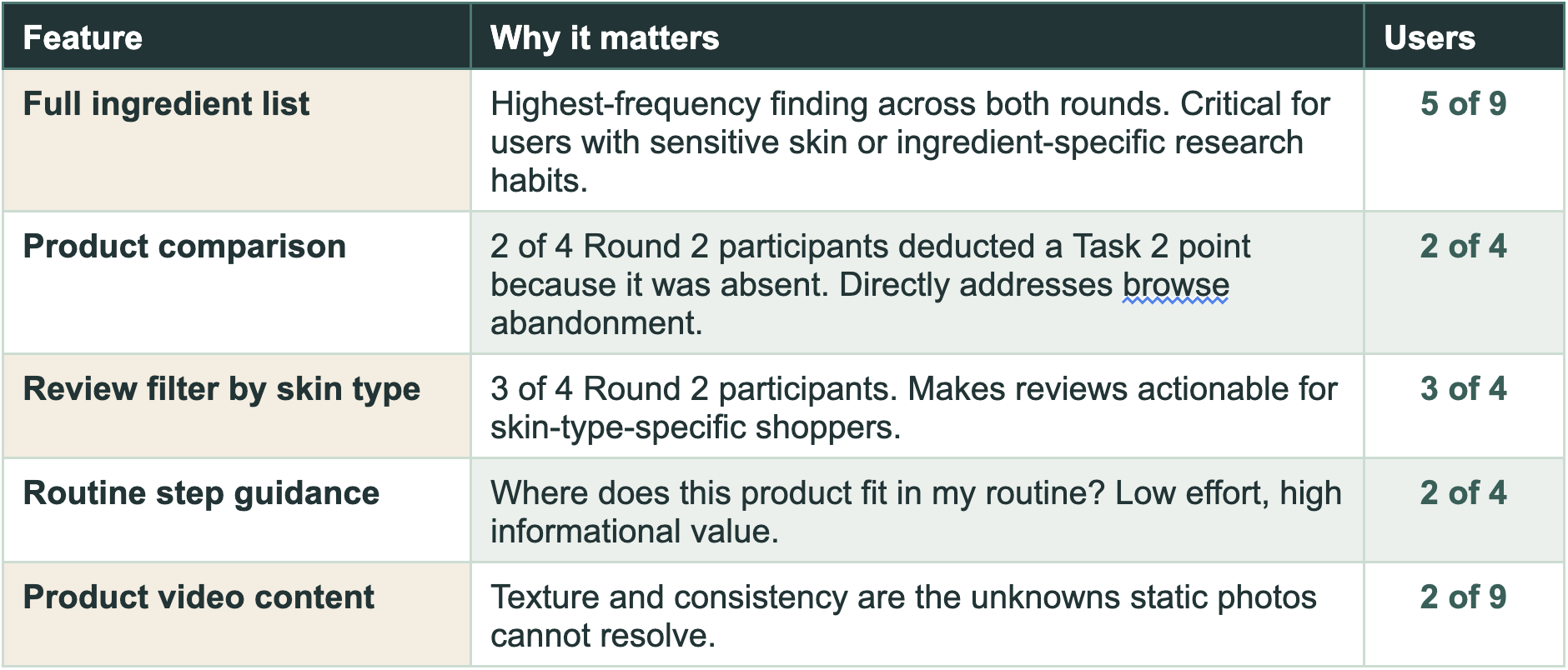
Dewy Island: Converting browsers into buyers
Springboard UX/UI Capstone 2
Role: UX/UI Designer
Timeline: 4 weeks
Tools: Figma, Figma Make, Mural, Google Suite, Zoom
Team: Modupe Aiyeola with mentorship support
Involved In:
Secondary Research
Competitive Analysis
Research Synthesis
User Flows
Style Guide
Hi-Fi Mockups
Prototyping
Usability Testing
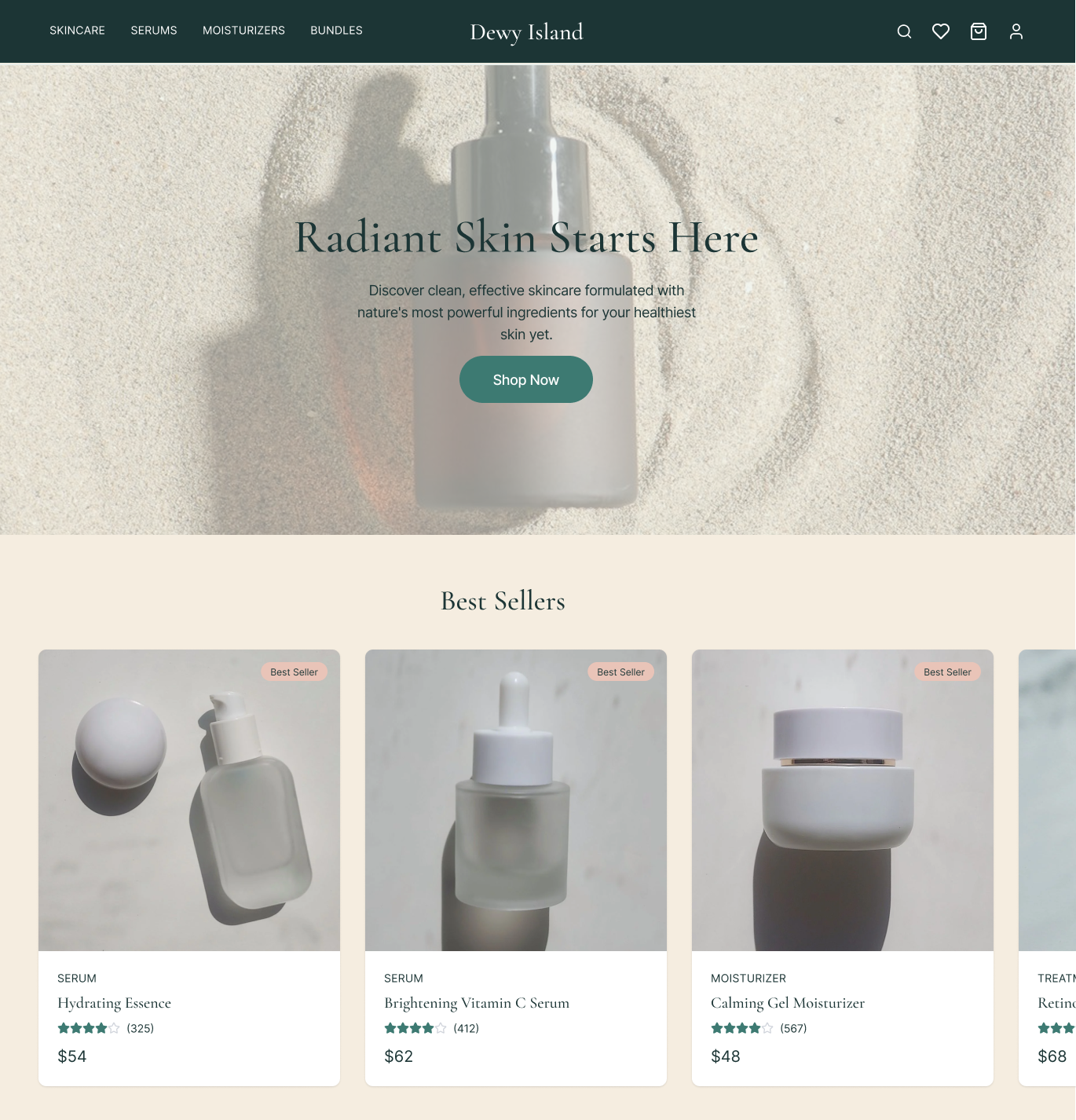
The Challenge
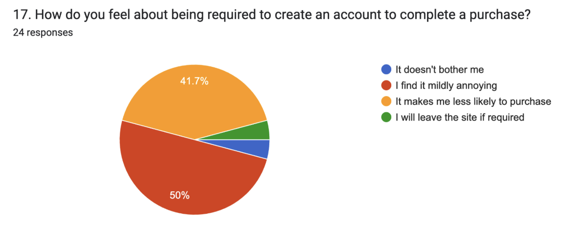
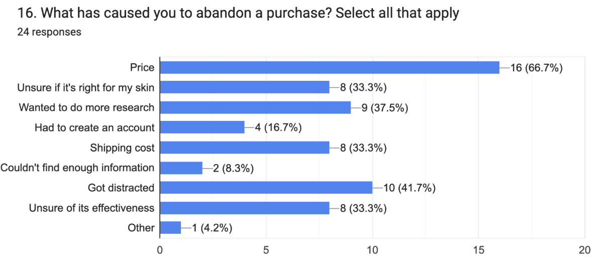
E-commerce retailers are faced with the issue of cart abandonment. 50% of users open multiple product pages and leave without adding those items to carts. 70% of users who added items to their cart abandoned them at the account creation page.
The Solution
A concern-based browse experience with ingredient education and social proof to build purchase confidence, paired with a guest checkout flow that removes the account creation barrier. Validated through two rounds of usability testing with 100% task completion and zero checkout drop-offs.
Research & Analysis
Secondary Research
I reviewed the skincare e-commerce landscape before designing anything and examined cart abandonment data, the role of visual content in conversion, and consumer trust signals.

Competitive Analysis
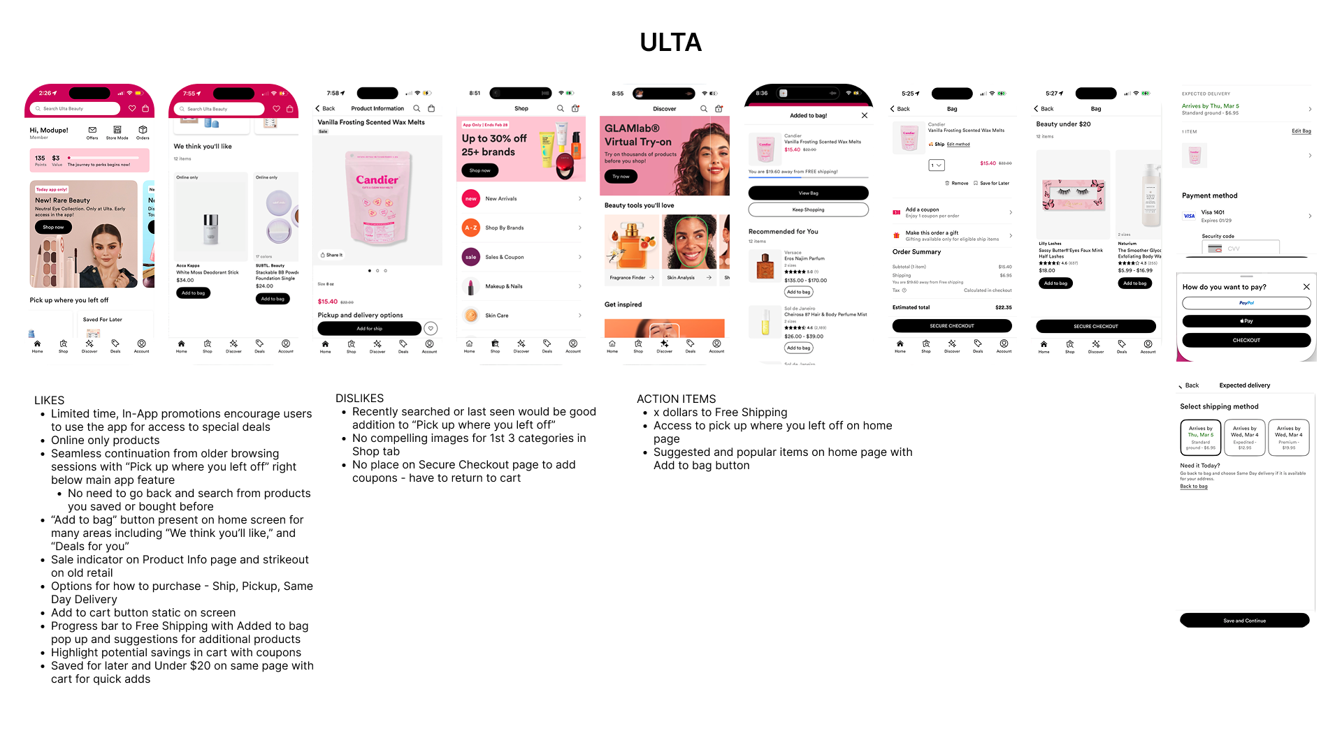
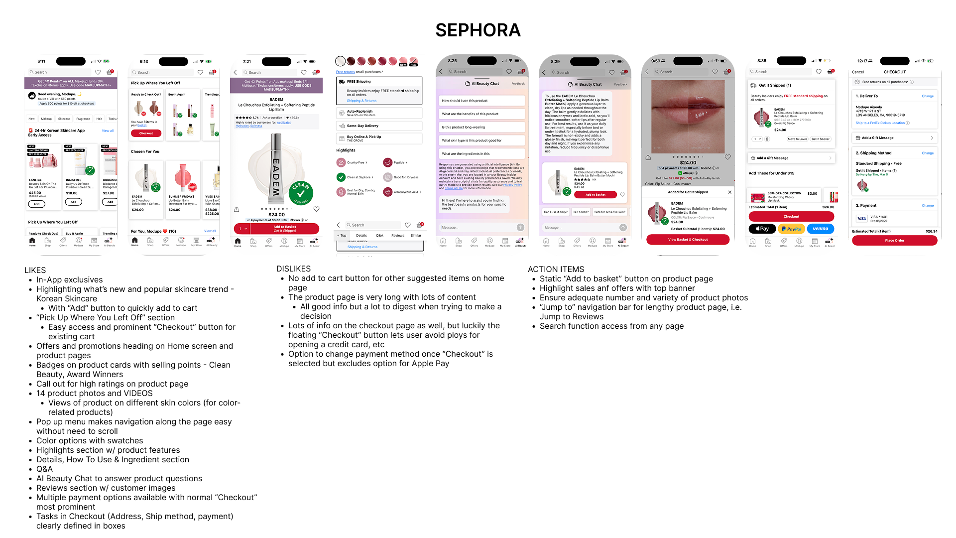
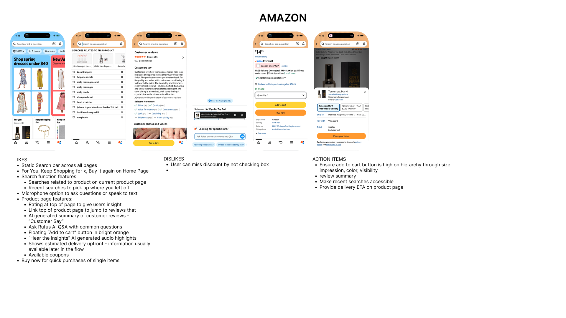
I compared Ulta, Sephora, and Amazon to understand what the market offers and where the gaps are.
The key gap:
None of the three competitors offer a side-by-side product comparison feature. For a category where users research heavily before buying, this is a direct design opportunity.
Screener Survey
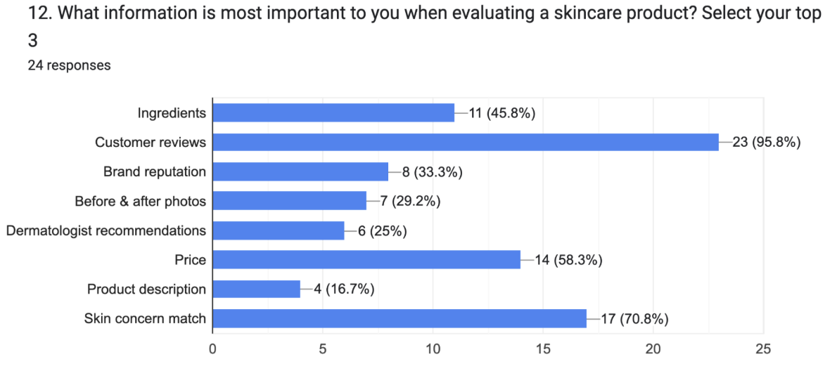
Before wireframing, I surveyed 24 participants to validate assumptions and understand real shopping behavior. Demographics were closely aligned with the target user: 83% age 29 to 38, 92% female.

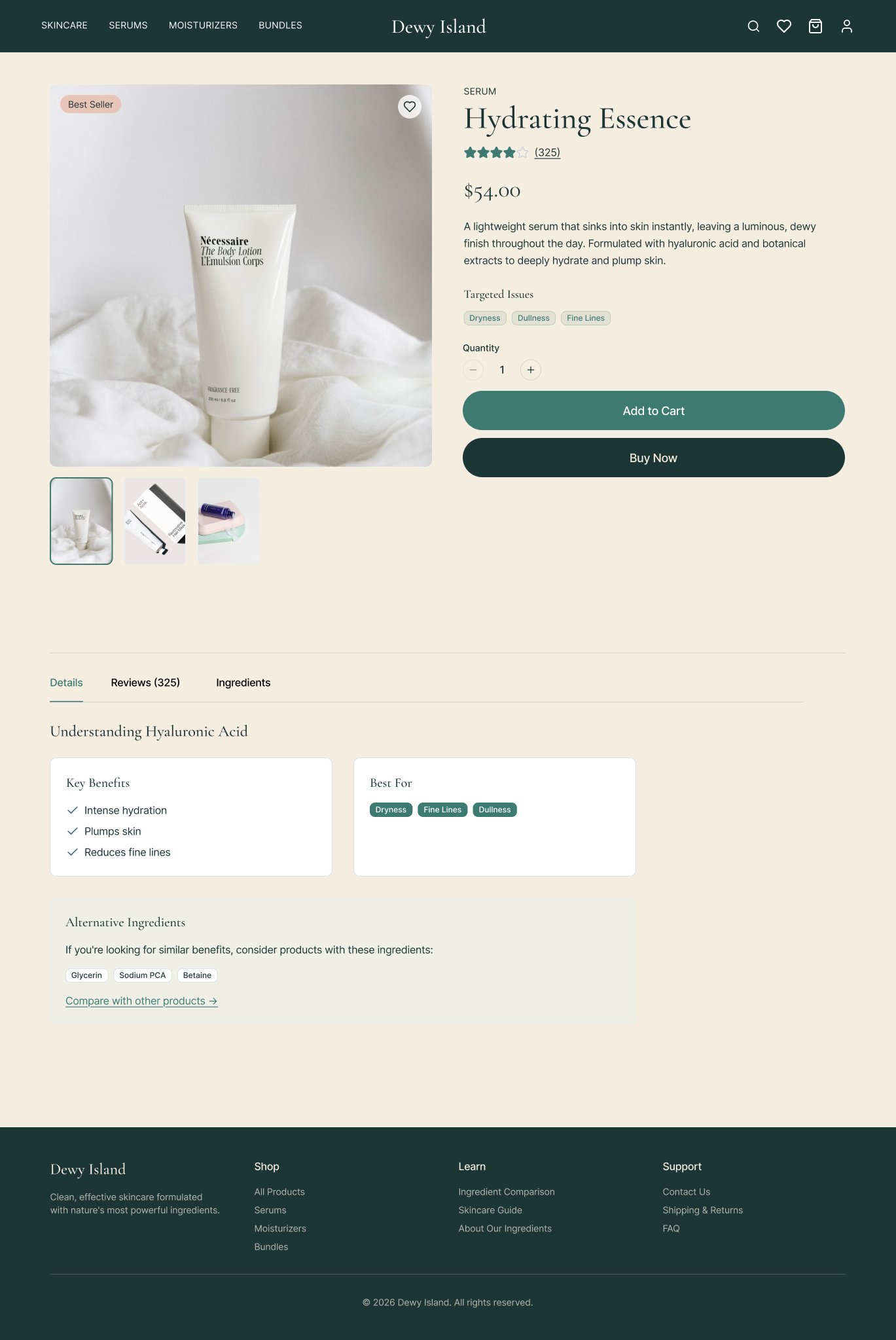
The ingredient confidence gap was the most important finding. Users wanted ingredient information but needed it explained, not just listed. That insight directly shaped every product detail page.
Design & Branding
Design
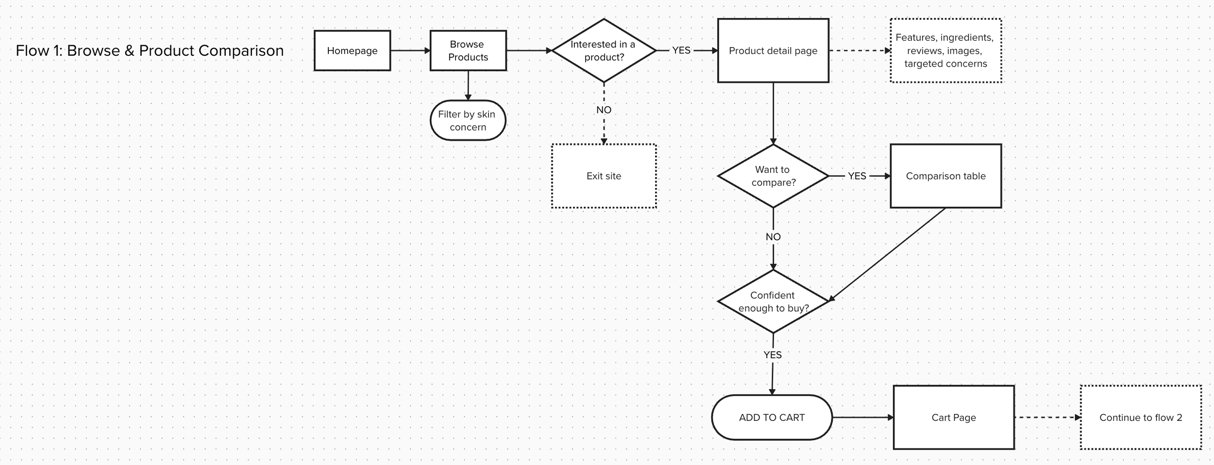
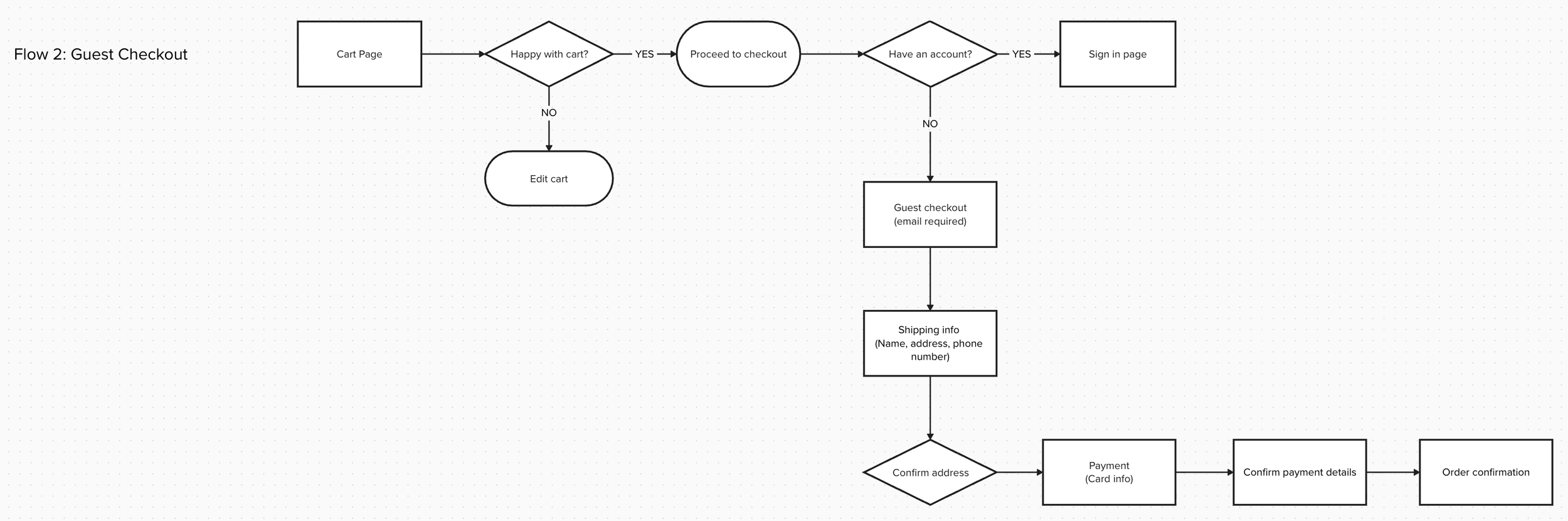
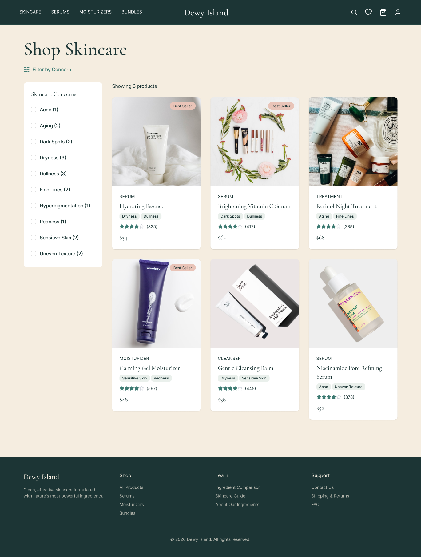
Every design decision traces back to one of the two business problems. Two user flows defined the scope before any screens were created.

Style Guide
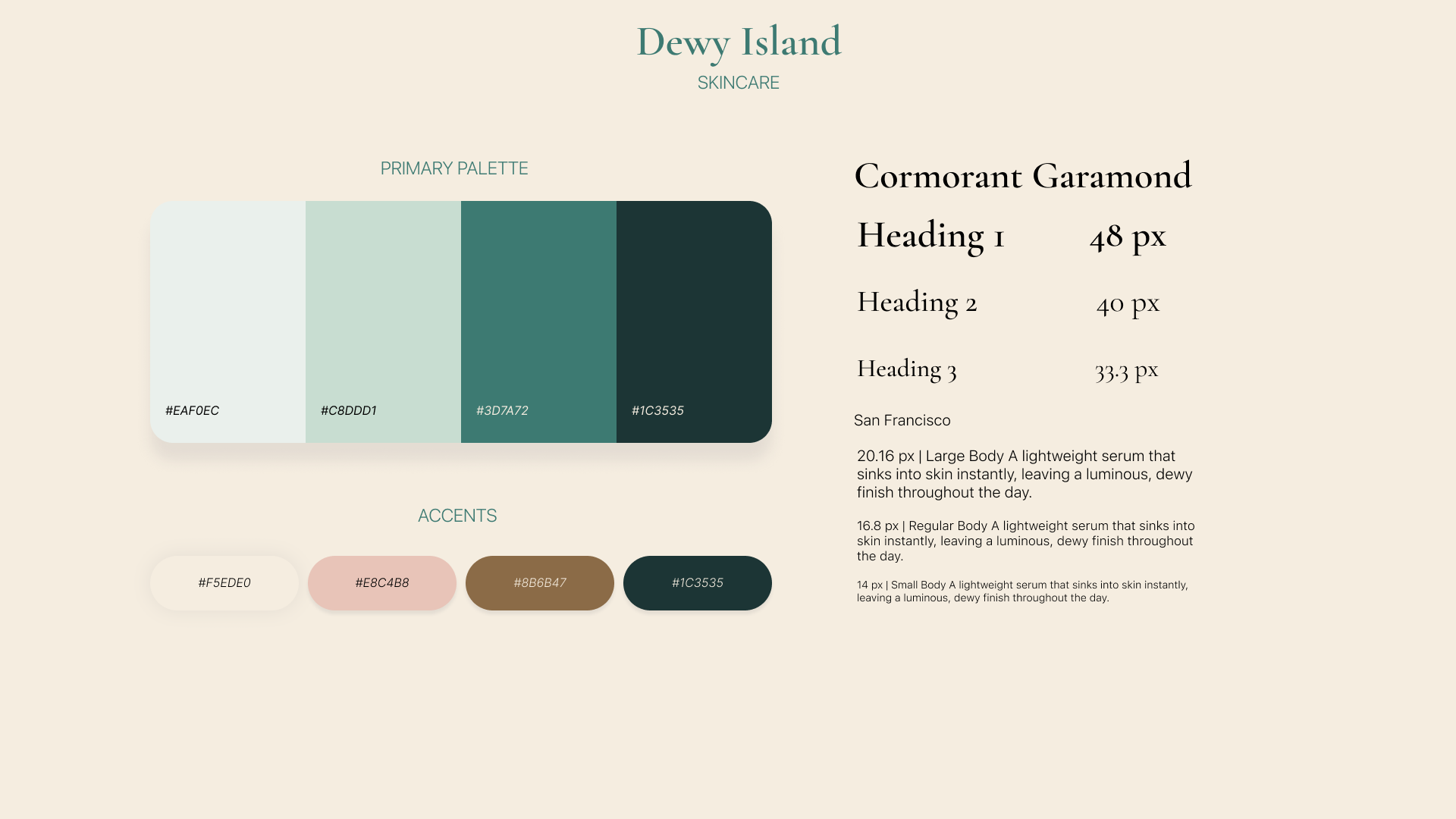
Built before any screens were designed to ensure consistency across both iterations.
Typography: Cormorant Garamond (display) paired with Jost (UI and body)
Color system: 8 brand colors with dedicated accessible text variants. All pairs verified at WCAG AA 4.5:1 minimum
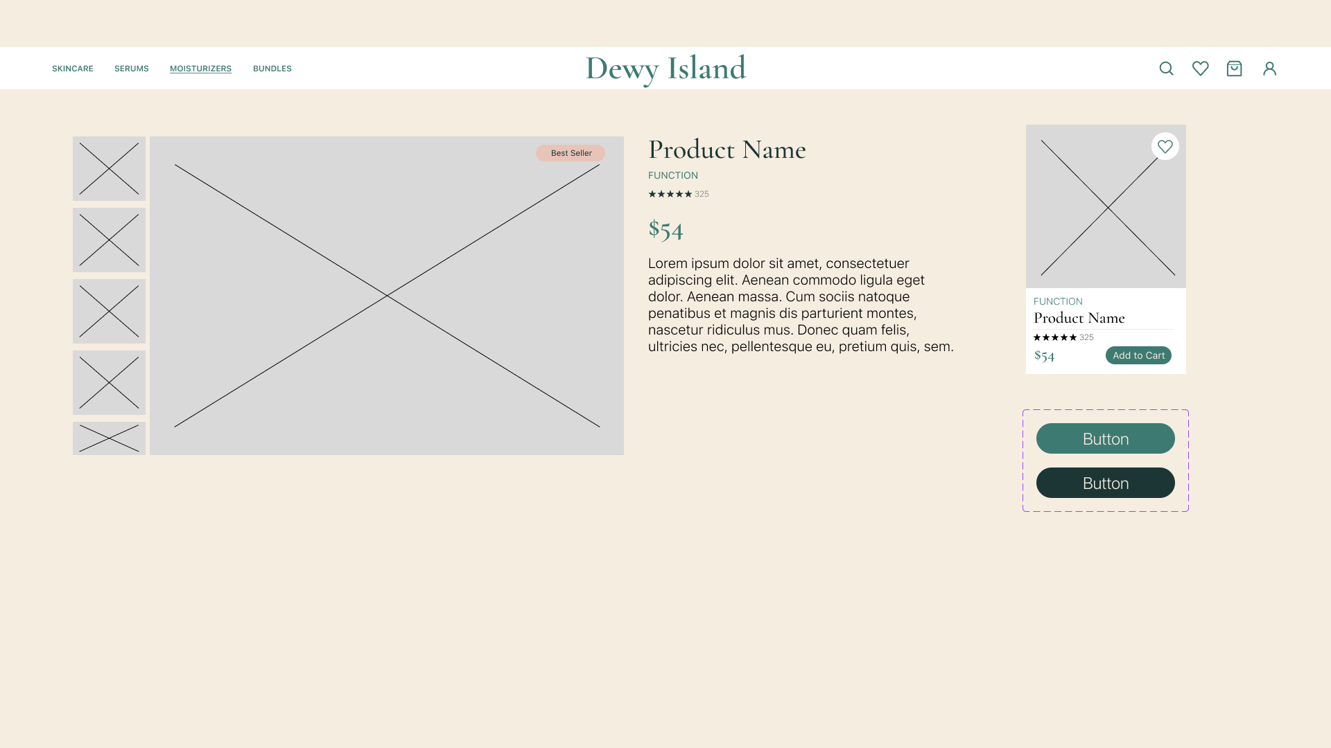
Component library: navigation, product cards, filter chips, comparison table, cart, and checkout
Prototyping
First prototype
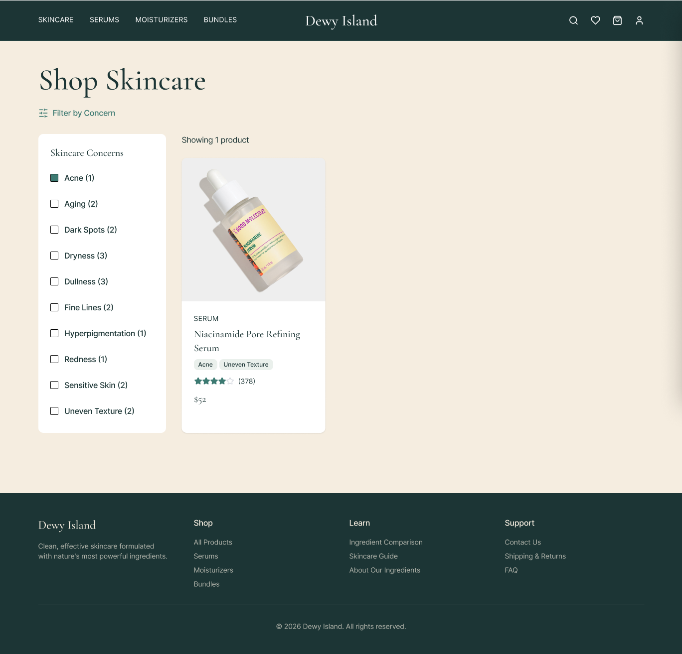
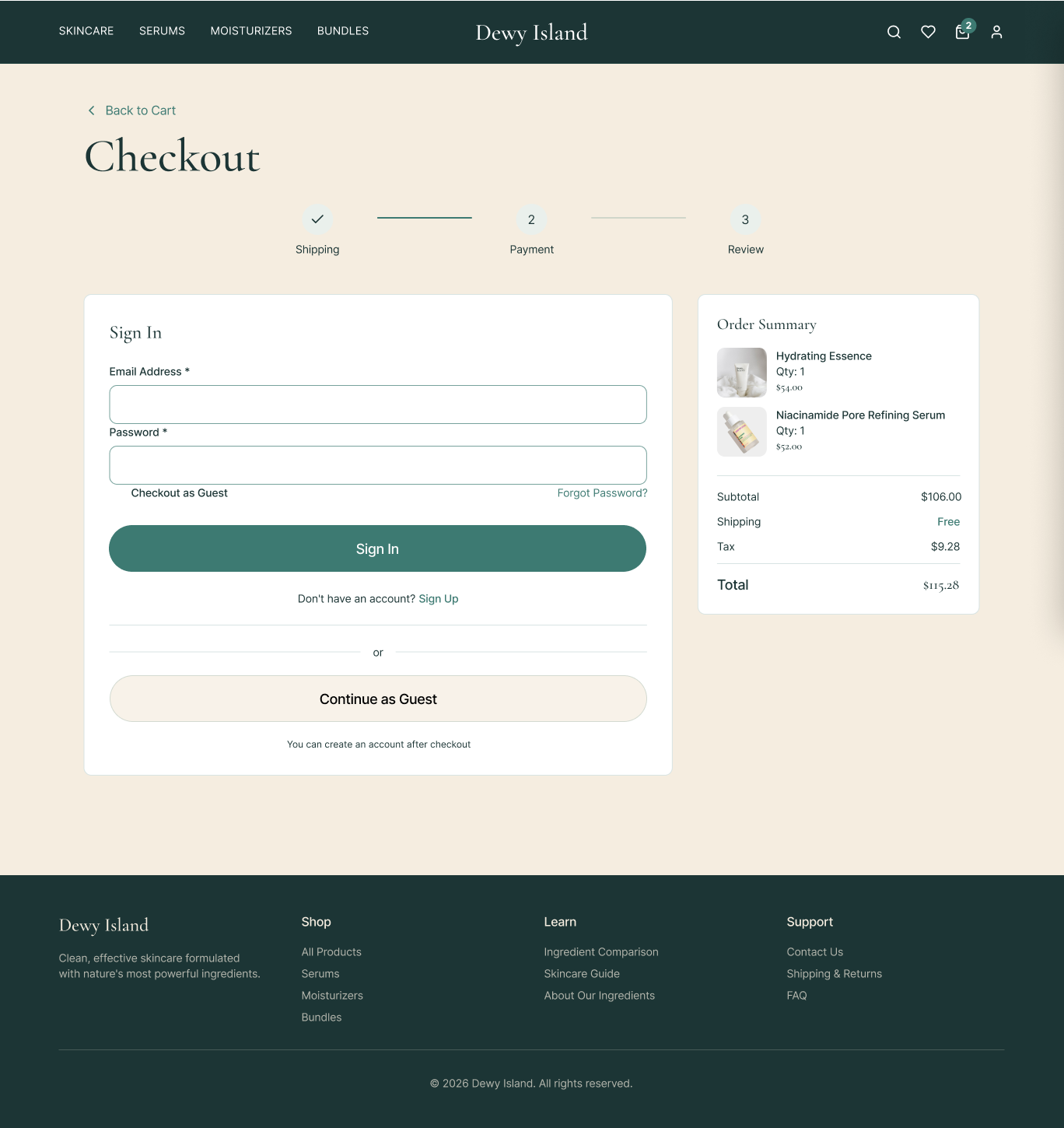
The first prototype covered both user flows in high fidelity. Key decisions:

Testing & Iteration
Testing: Round One
Two rounds of moderated usability testing with 9 participants total. Each session covered 3 tasks mapped directly to the two user flows.

Round One Changes

Before: Filter button missed by 1 of 5 users on first scan

After: Changed to an accent-colored button. Immediately visible against the product grid background.
————————————————————————————————————————————————————————————————————————————
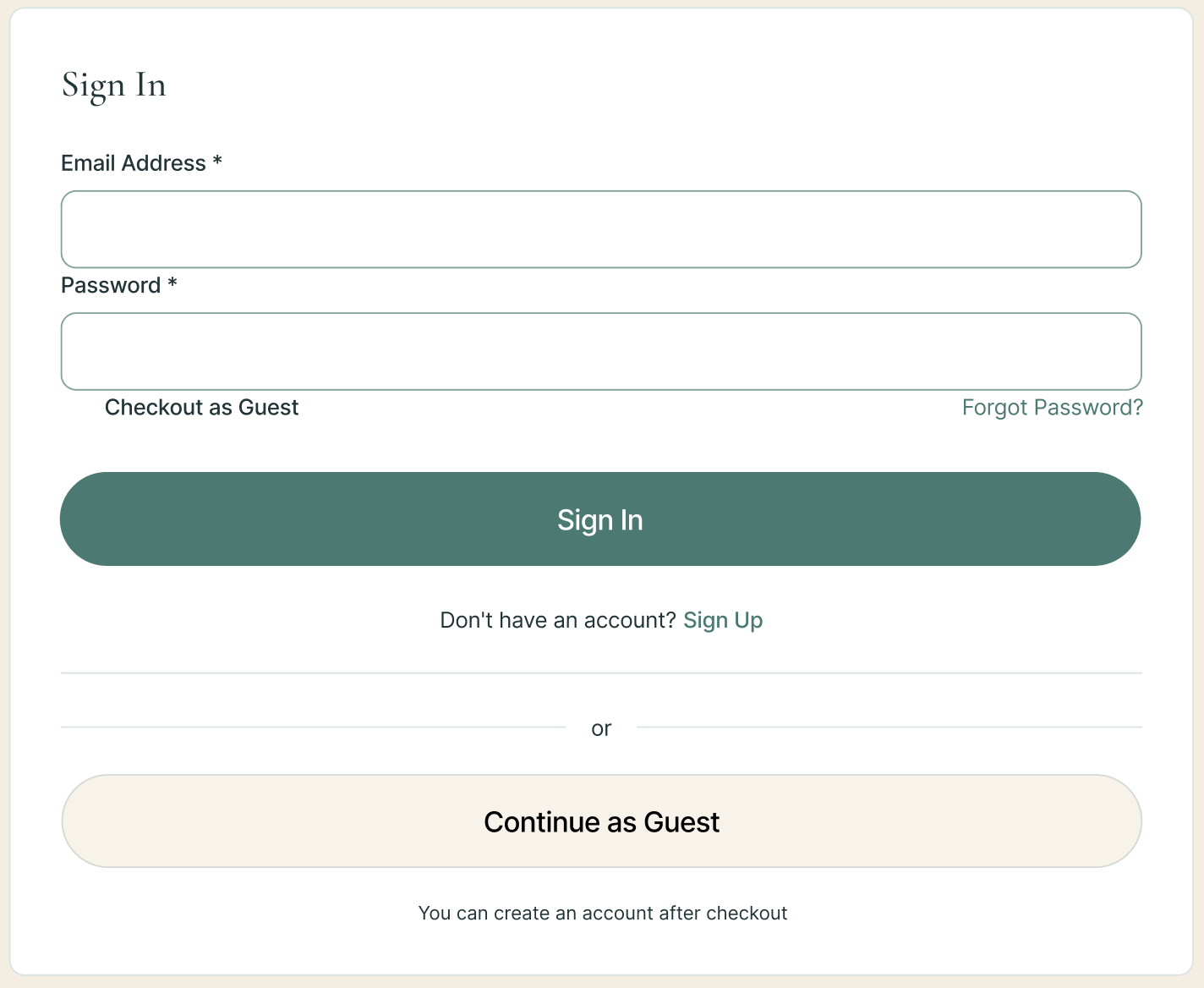
Before: 1 user navigated to sign-in instead of guest checkout
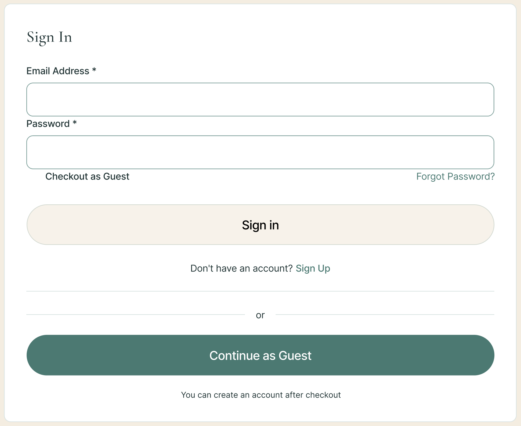
After: Guest checkout became the primary button. Sign-in moved to secondary.
Testing: Round Two

Round Two Changes
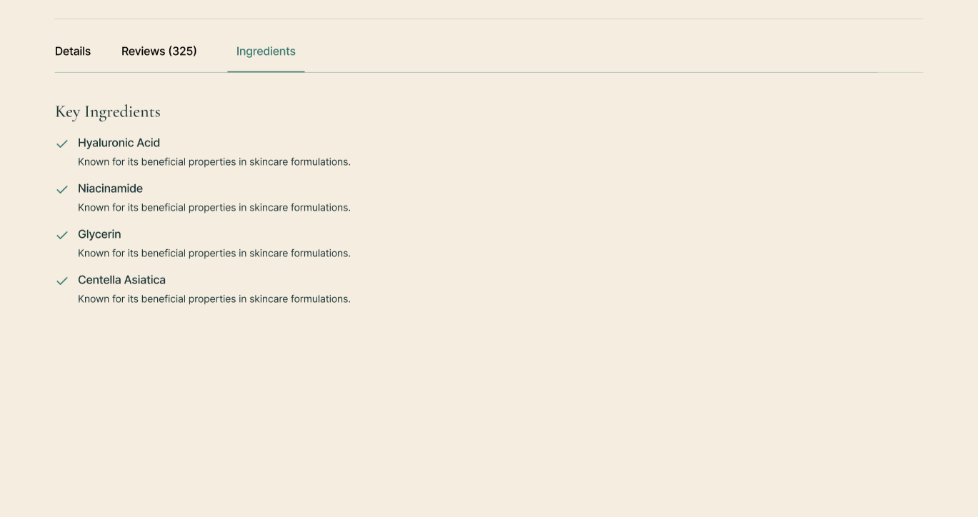
Before: 3 of 4 wanted longer, more descriptive ingredient copy
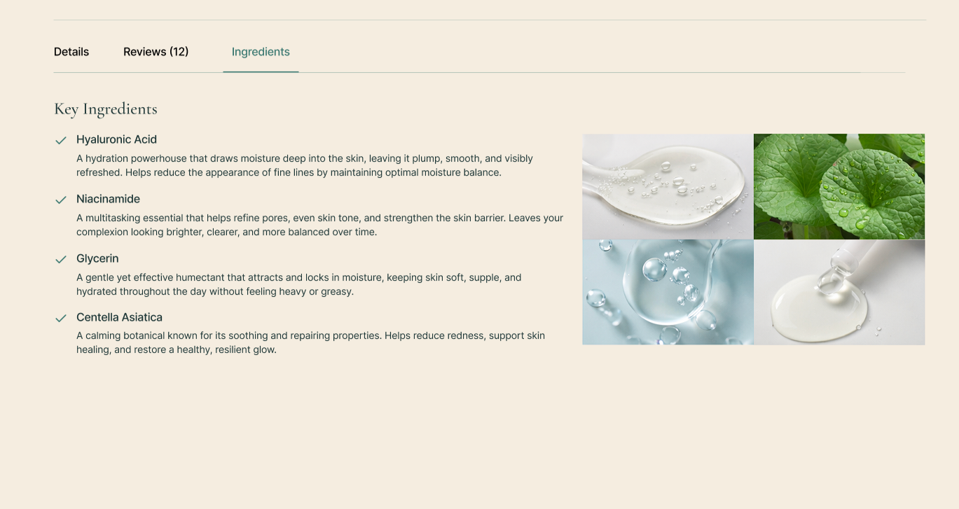
After: Rewrote all key ingredient descriptions with more detail and added images.
————————————————————————————————————————————————————————————————————————————
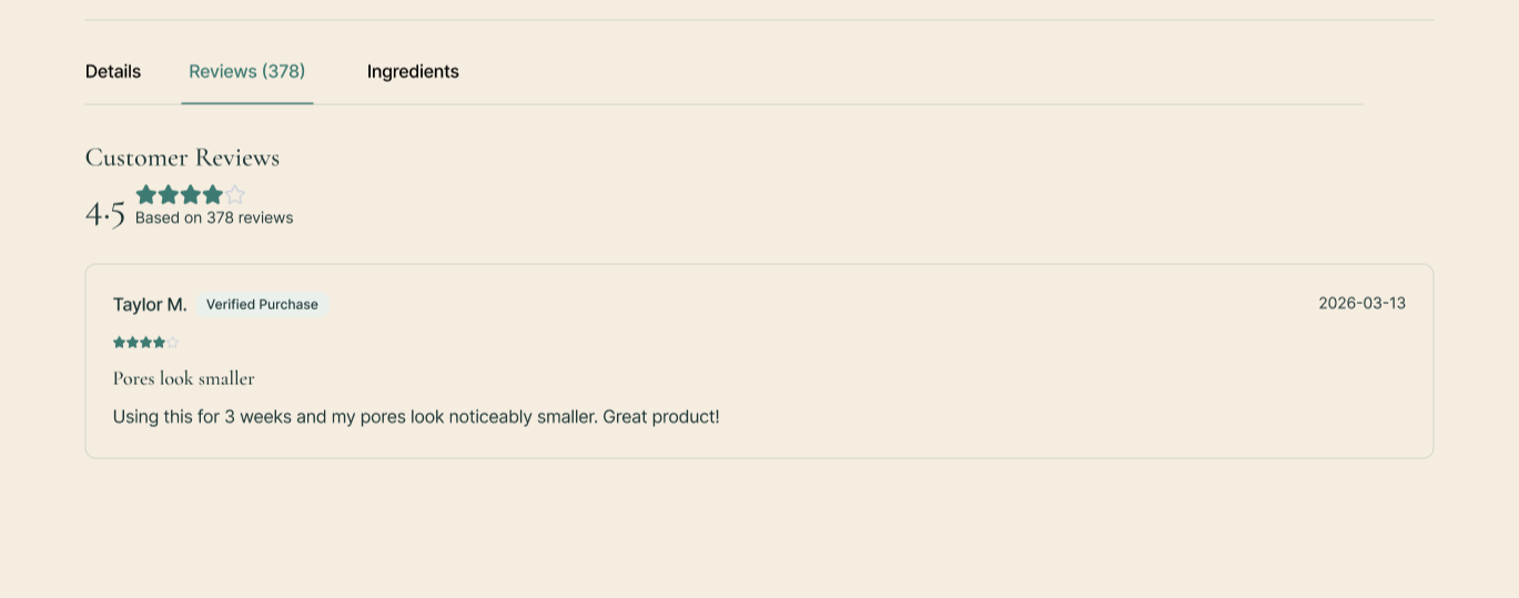
Before: 3 of 4 wanted to filter reviews by star rating
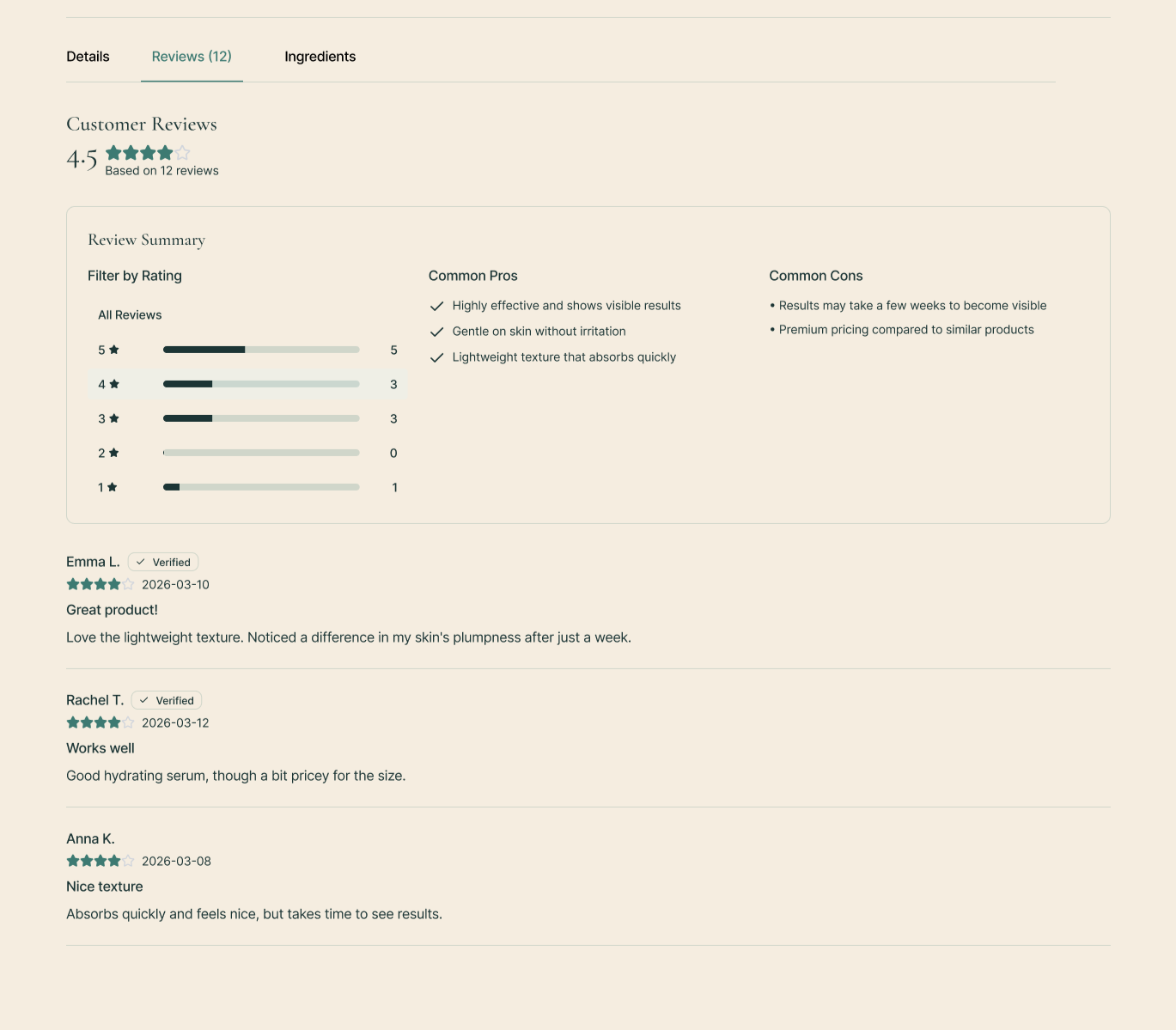
After: Added review filter with star rating selector and empty state for no results.
Results & Next Steps
Results
At the end of the 2nd round of testing, all KPIs were met, and the design was proven to support users in confident decision-making and turning browsing in to buying.

What’s Next